
JS media queries with React hooks
This post assumes you’re using React (16.8 or later).
One thing I like about styled-components is that it enables concise and declarative media queries (granted, regular media queries are already declarative[^1]). On this site, I use a file that exports the following mediaQueries object.
const min = width => `only screen and (min-width: ${width}em)`
const max = width => `only screen and (max-width: ${width}em)`

// screen sizes in em units
export const screens = {
  phone: 30,
  phablet: 40,
  tablet: 50,
  netbook: 60,
  laptop: 70,
  desktop: 100,
}

export const mediaQueries = Object.entries(screens).reduce((acc, [key, val]) => {
  const Key = key[0].toUpperCase() + key.substr(1)
  acc[`min` + Key] = `@media ` + min(val)
  acc[`max` + Key] = `@media ` + max(val)
  return acc
}, {})
To get consistent media queries across a project, you simply import that object wherever you need a media query:
import styled from 'styled-components'

import { mediaQueries } from 'src/utils/mediaQueries.js'

const { minPhone, maxPhone } = mediaQueries

export default styled.div`
  ${maxPhone} {
    // some styles to apply only on phones
  }
  ${minPhone} {
    // some styles to apply on screens larger than phones
  }
`
However, sometimes CSS alone doesn’t cut it. Thankfully, window.matchMedia makes it very easy to use media queries directly in JavaScript without any 3rd party dependencies! And it even has great browser support.
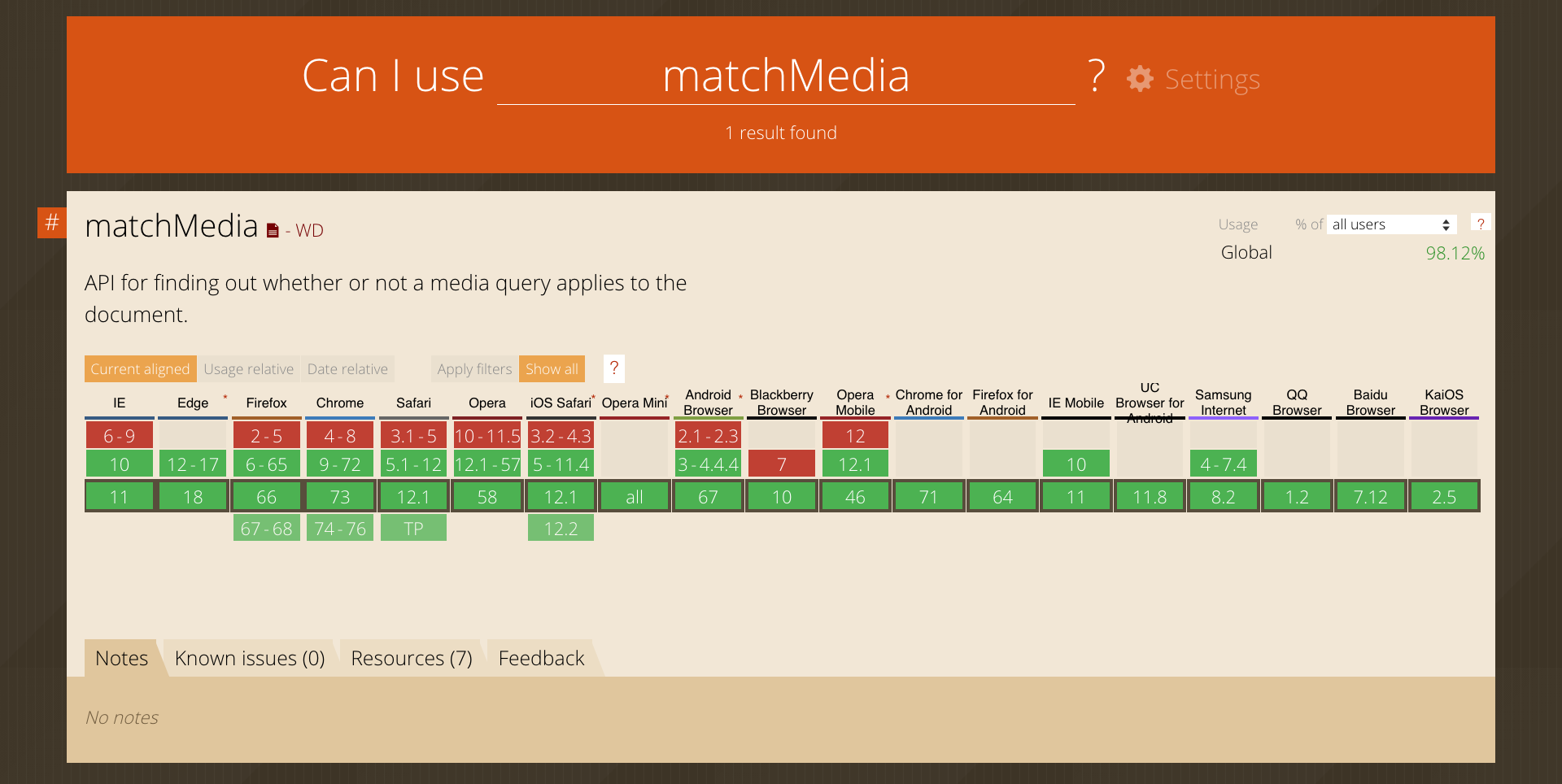
window.matchMedia browser support
window.matchMedia in React
Here’s how you’d use it in React:
import React, { useEffect, useState } from 'react'

import { Desktop, Mobile } from 'src/components'

const maxPhone = `only screen and (max-width: 30em)` // highlight-line

export default function ResponsiveComponent(props) {
  // highlight-start
  const query = window.matchMedia(maxPhone)
  const [match, setMatch] = useState(query.matches)
  // highlight-end

  useEffect(() => {
    const handleMatch = (q) => setMatch(q.matches)
    query.addListener(handleMatch)
    return () => query.removeListener(handleMatch)
  })

  return match ? <Mobile {...props} /> : <Desktop {...props} /> // highlight-line
}
Note that JS media queries like maxPhone need to omit the @media prefix present in CSS media queries. window.matchMedia(maxPhone) then turns that string into a query object which becomes the JavaScript equivalent of @media screen and (max-width: 30em). We call useState to manage whether or not the query currently matches the screen size, followed by useEffect which creates an event listener that updates the query status on window resizes. Finally, we return the Mobile or Desktop implementation of ResponsiveComponent, depending on the state of the query.
If you’re server-side rendering (SSR), you’ll need to wrap this code in a check that ensures the window object is defined.
import React, { useEffect, useState } from 'react'

const maxPhone = `screen and (max-width: 30em)`

export default function ResponsiveComponent(props) {
  // highlight-next-line
  if (typeof window !== `undefined`) {
    const query = window.matchMedia(maxPhone)
    const [match, setMatch] = useState(query.matches)

    useEffect(() => {
      const handleMatch = (q) => setMatch(q.matches)
      query.addListener(handleMatch)
      return () => query.removeListener(handleMatch)
    })

    return match ? <Mobile {...props} /> : <Desktop {...props} />
  } else return null // highlight-line
}
Hook it up
Since this functionality will likely be reused many times, it makes sense to turn it into a custom hook. Let’s call it useMediaQuery.
import { useEffect, useState } from 'react'

export const useMediaQuery = (query, cb) => {
  const [matches, setMatches] = useState(false)

  useEffect(() => {
    const qry = window.matchMedia(query)
    setMatches(qry.matches)

    const handleMatch = q => {
      setMatches(q.matches)
      if (cb instanceof Function) cb(q.matches)
    }

    qry.addListener(handleMatch)
    return () => qry.removeListener(handleMatch)
  }, [query, cb])

  return matches
}
useMediaQuery is more versatile than just checking for screen sizes. For instance, you could also pass it the string prefers-color-scheme: (light|dark) to check if the user has his device set to a dark or light color mode and adjust the style of your site accordingly.
This hook accepts a callback function as second argument. cb will be triggered by useMediaQuery whenever the state of the media query changes. Continuing our dark mode example, this might be useful if you have a function that sets the colors of your site and that needs to be triggered when a user is browsing your site in the evening while it gets dark and the device automatically switches from light to dark mode.
Back to screen sizes. One last thing to mention is if you find yourself using JS media queries a lot, it might become annoying to have to type the whole query string (maxPhone in the above example) every time. In that case, it would easier (and help with consistency) to create a second hook that’s coupled to the mediaQueries object. To that end, you’ll need to modify src/utils/mediaQueries.js to contain each media query both in its CSS and JS variant, i.e. with and without the @media prefix.
const min = width => `only screen and (min-width: ${width}em)`
const max = width => `only screen and (max-width: ${width}em)`

// screen sizes in em units
export const screens = {
  phone: 30,
  phablet: 40,
  tablet: 50,
  netbook: 60,
  laptop: 70,
  desktop: 100,
}

export const mediaQueries = Object.entries(screens).reduce((acc, [key, val]) => {
  const Key = key[0].toUpperCase() + key.substr(1)
  // css query
  acc[`min` + Key] = `@media ` + min(val)
  acc[`max` + Key] = `@media ` + max(val)
  // highlight-start
  // js query (see window.matchMedia)
  acc[`min` + Key + `Js`] = min(val)
  acc[`max` + Key + `Js`] = max(val)
  // highlight-end
  return acc
}, {})
And then we create a wrapper for useMediaQuery. Let’s call it useScreenQuery.
import { useMediaQuery } from 'hooks/mediaQueries'
import { mediaQueries } from 'utils/mediaQueries'

const validKeys = Object.keys(mediaQueries).filter(key => !key.includes(`Js`))

export const useScreenQuery = (key, cb) => {
  if (!mediaQueries[key + `Js`])
    throw new TypeError(
      `useScreenQuery received invalid key: ${key}. Should be one of ${validKeys}`
    )
  return useMediaQuery(mediaQueries[key + `Js`], cb)
}
As an example, here’s how you might call useScreenQuery to switch between a MobileNav and a DesktopNav.
import React from 'react'
import { graphql, useStaticQuery } from 'gatsby'
import { useScreenQuery } from 'hooks'
import { DesktopNav, MobileNav } from 'components'

export default function Nav(props) {
  // useScreenQuery returns true or false on client, undefined in SSR.
  const mobile = useScreenQuery(`maxPhablet`) // highlight-line
  if (mobile) return <MobileNav {...nav} {...props} />
  // Only render DesktopNav if screen query is false.
  if (mobile === false) return <DesktopNav {...nav} {...props} /> // highlight-line
  // Render nothing in SSR to avoid showing DesktopNav on mobile
  // on initial page load from cleared cache.
  return null // highlight-line
}
For a more elaborate example involving a media query with multiple break points, check out the useMedia post on usehooks.com.
[^1]: solve problems without requiring the programmer to specify an exact procedure to be followed